
The Architecture
of Abuse.
[Speculative Campaign Design.]
About the Project
'The Architecture of Abuse' is an innovative awareness campaign created for a UK domestic violence charity. The project visually explores the insidious nature of psychological abuse in a unique way, contrasting the controlling language of abusers with beautiful imagery inspired by interior design aesthetics.
The Concept
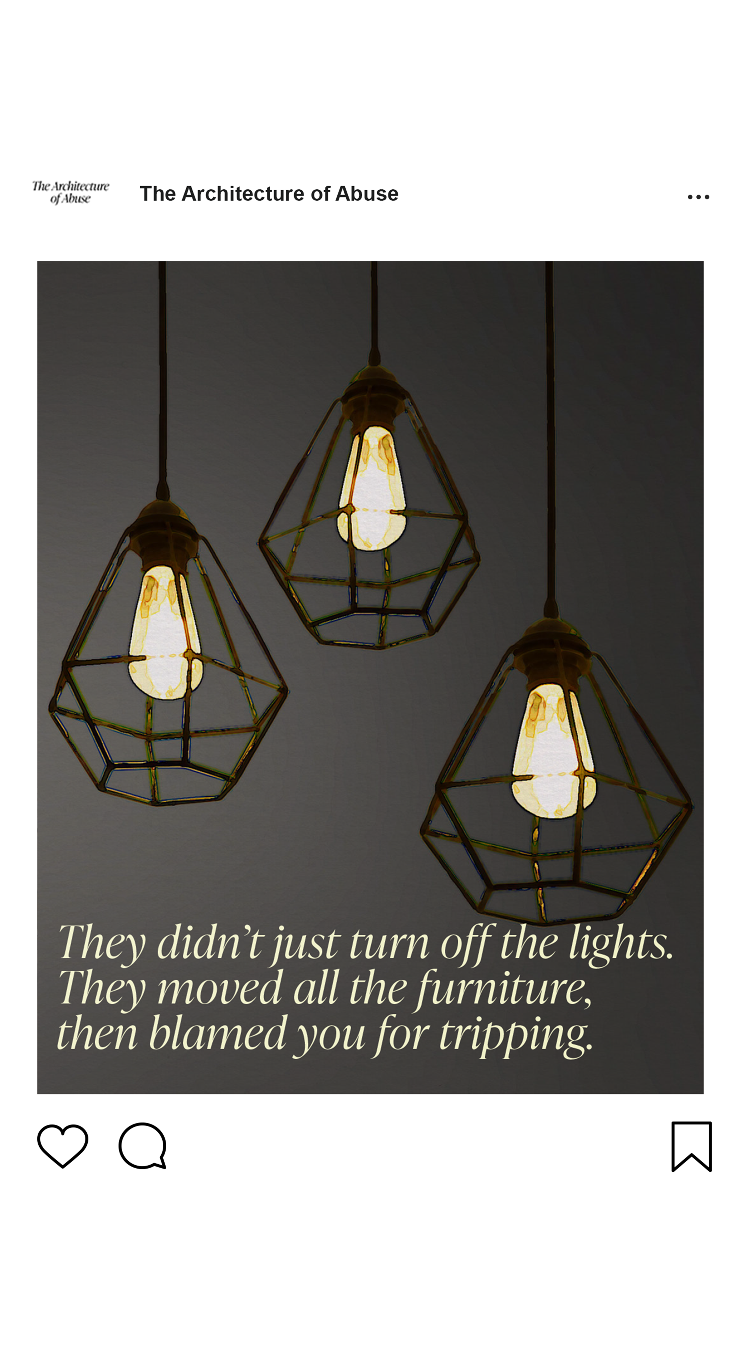
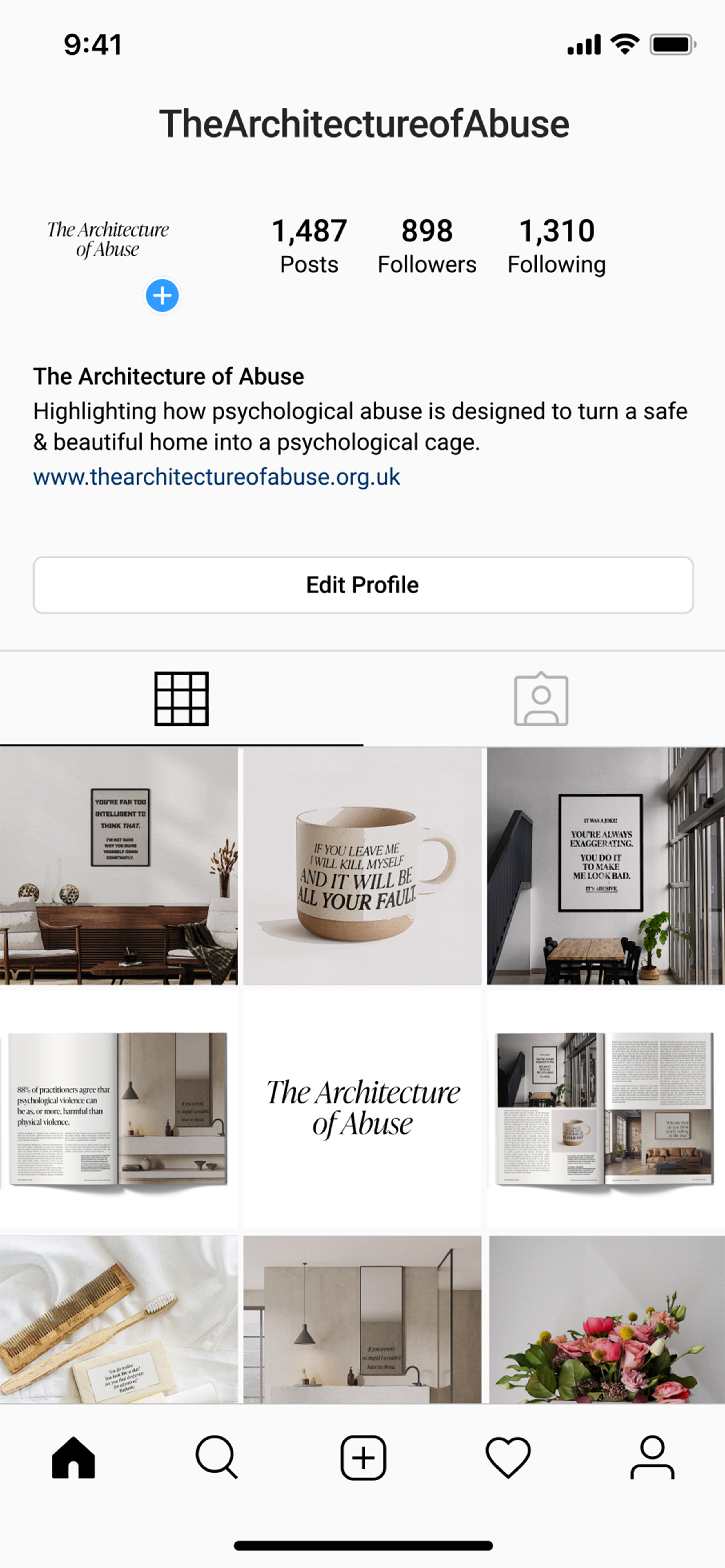
The campaign features common abusive phrases, such as "If you weren’t so stupid, I wouldn’t have to shout" or "if you leave me, I will kill myself and it will be all your fault," presented within beautiful, Instagram-worthy home designs. By integrating these phrases into interior design visuals, the subtle and insidious way psychological abuse can dominate a person's life and environment is shown to the audience.
The Strategy
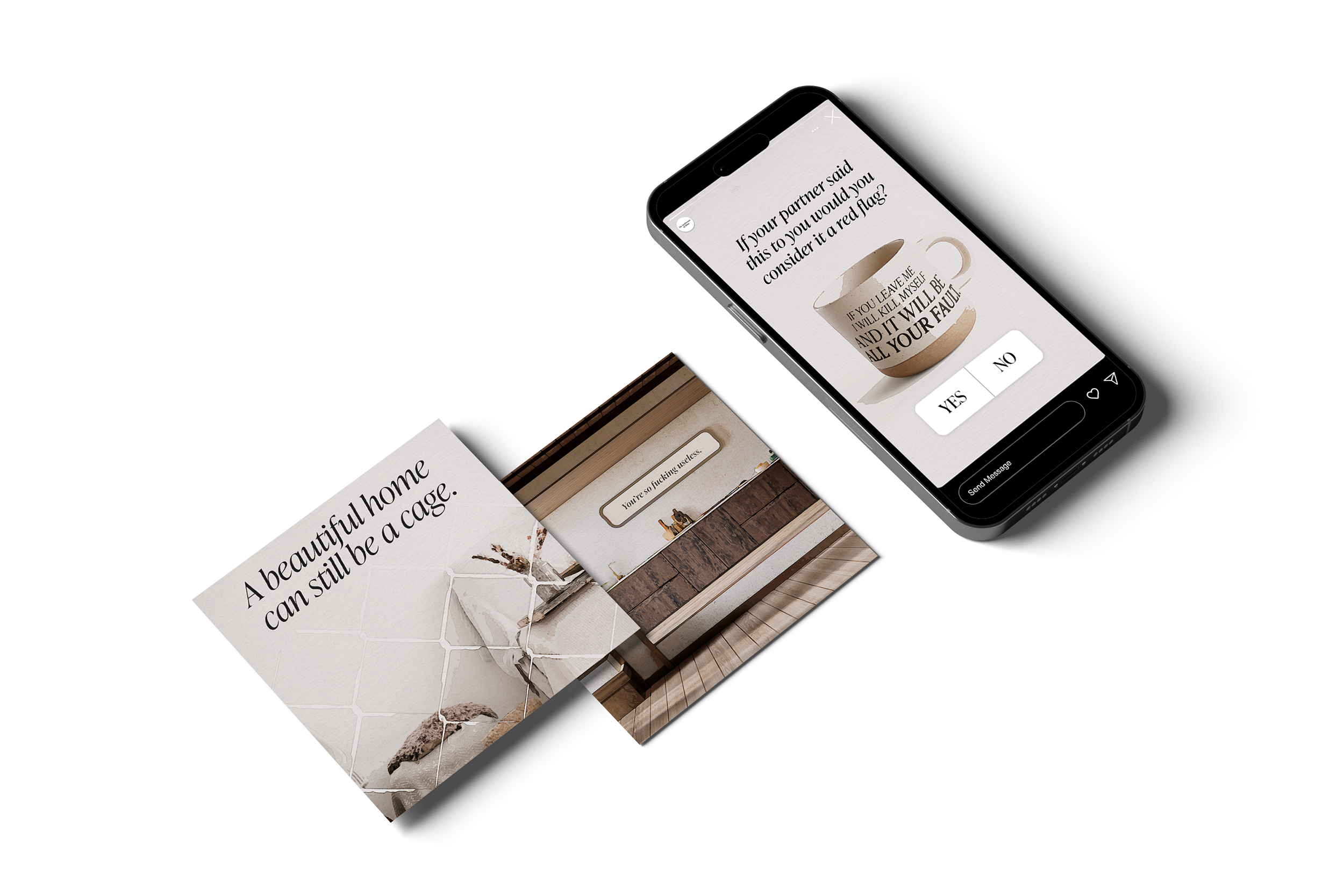
Designed primarily for Instagram's audience of over 2 billion users, the campaign's visuals are crafted for maximum engagement. The use of home decor elements places the campaign directly into feeds focused on interior design, not only reaching an audience, but also allowing it to stand out in a space it is not expected. This approach transforms the issue of psychological abuse into a visually compelling and shareable message.
'The Architecture of Abuse’ turns beautiful and visually pleasing imagery into a powerful tool for social change while also raising awareness about the issue of psychological abuse.
-
This project challenged me to tackle a difficult subject and translate it into an impactful campaign. My goal was to create something that would not only raise awareness but also communicate a message innovatively, while keeping the intended audience and who it was being designed for at the forefront of all design decisions.
Placing the campaign in unexpected places, such as interior design magazines and specific areas of social media feeds, made the message far more impactful. Exploring strategic context in this way enabled the designs to stay focused and relevant. It forced the audience to confront the issue in a space they typically associate with comfort and beauty.
I believe one of the project’s biggest strengths is the concept. The idea of linking psychological abuse [which, by its very nature, is designed] to interior design provided a powerful framework for all the design decisions, from typography to image selection. My love of research allowed me to ensure that I kept the project informed, relevant, and factual.
There would be potential to explore further partnerships with home décor brands and opportunities to move the campaign away from digital and printed material and feature it within stores, utilising disruptive design methods.
-
Campaign Concept & Development
Visual Identity Design
Layout Design
Typography
Conceptual Thinking
Research
Problem-Solving
Storytelling
Adobe Photoshop
Adobe InDesign
Adobe Illustrator
Figma

Social Media


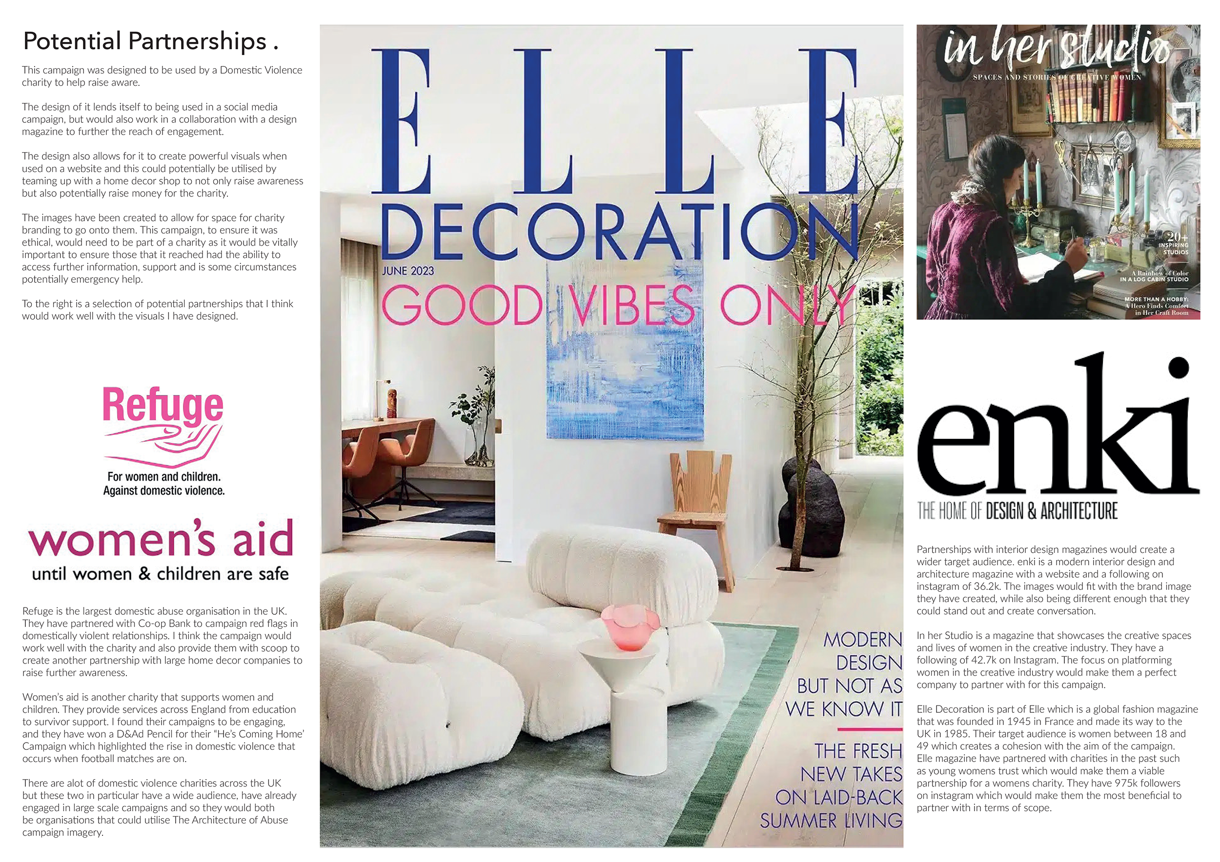

A key component of this campaign was the ability to reach a wide audience. Through research, I identified potential partnerships that could significantly amplify the message.
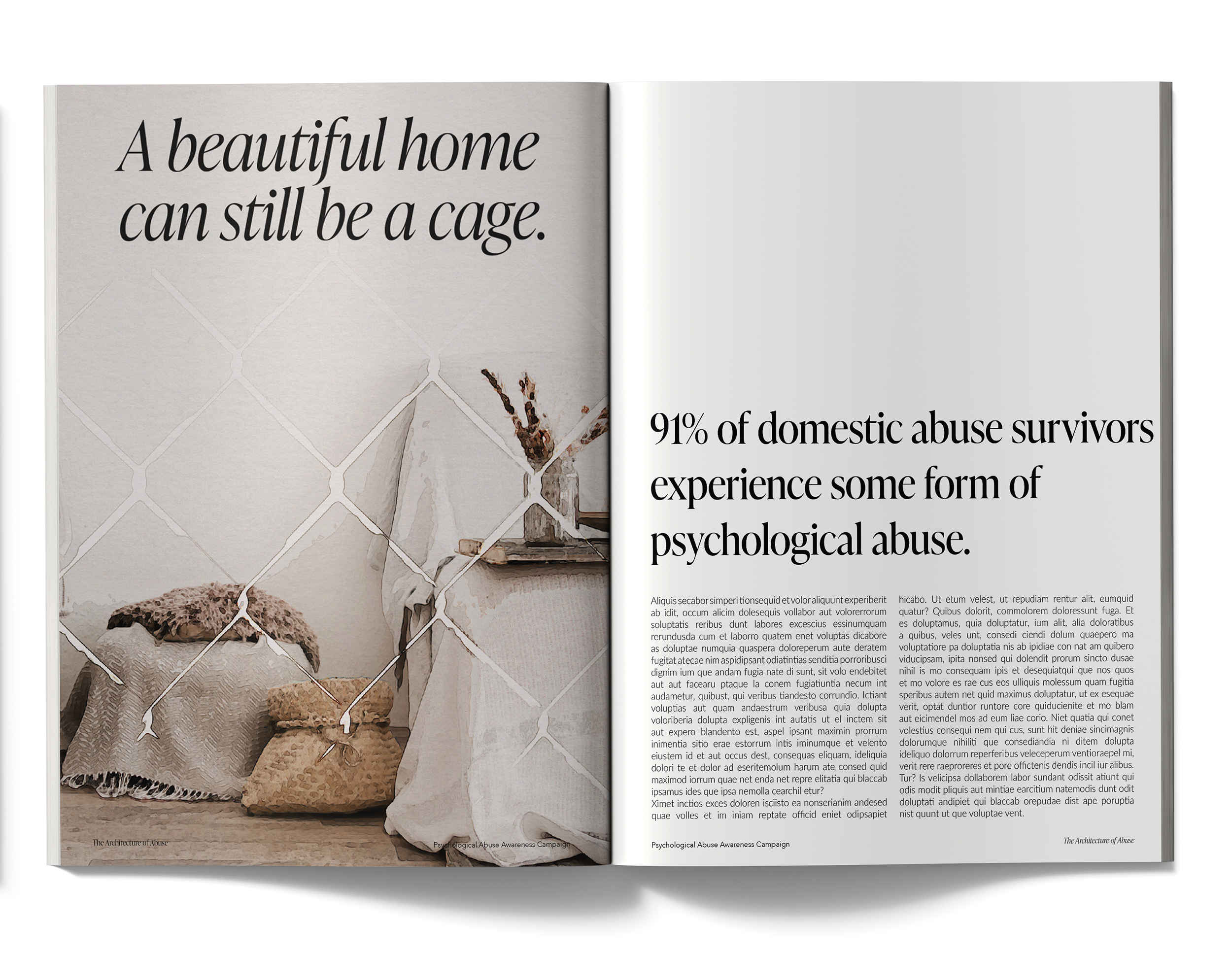
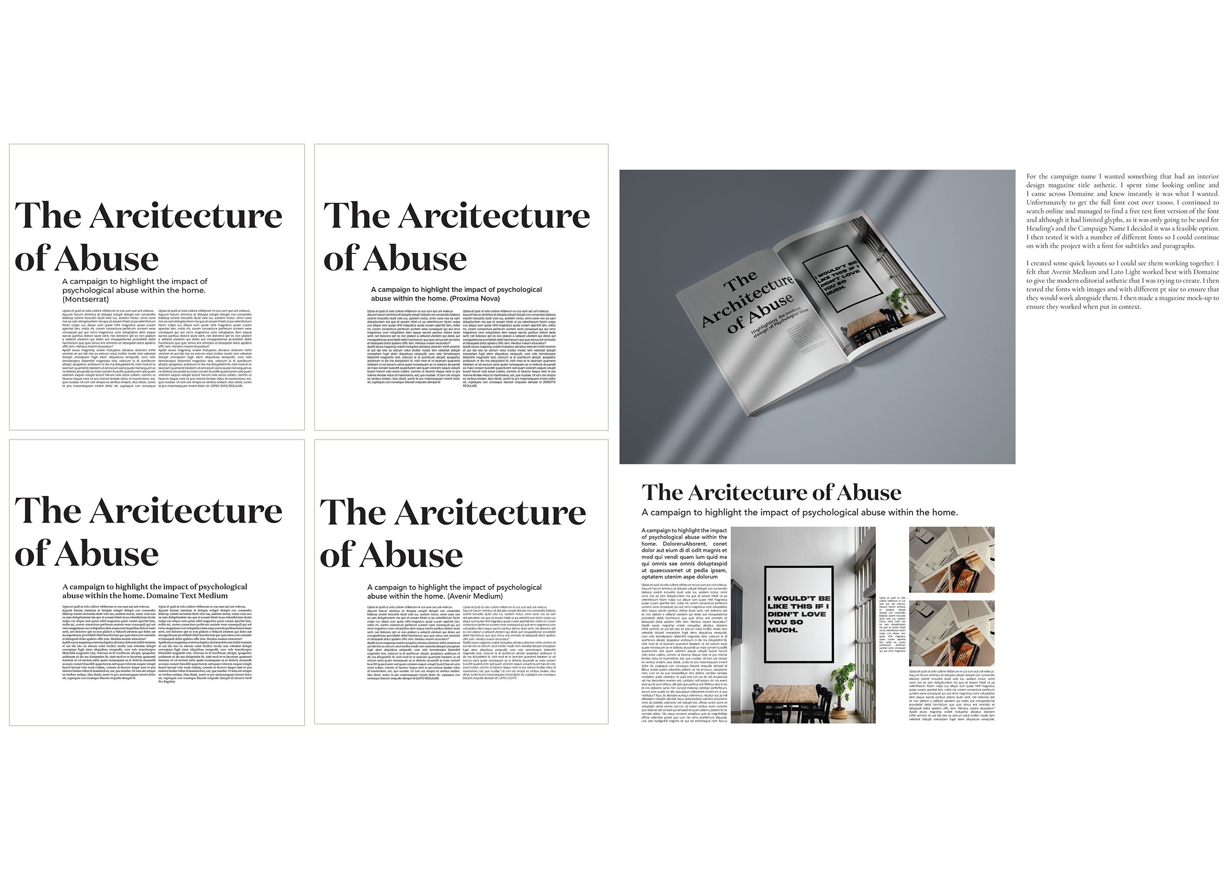
The mockups below demonstrate a visual plan for how 'The Architecture of Abuse' could be featured in leading home and interior design magazines, utilising another form of media to maximise engagement and raise awareness.
Potential Partnerships
Working Process.
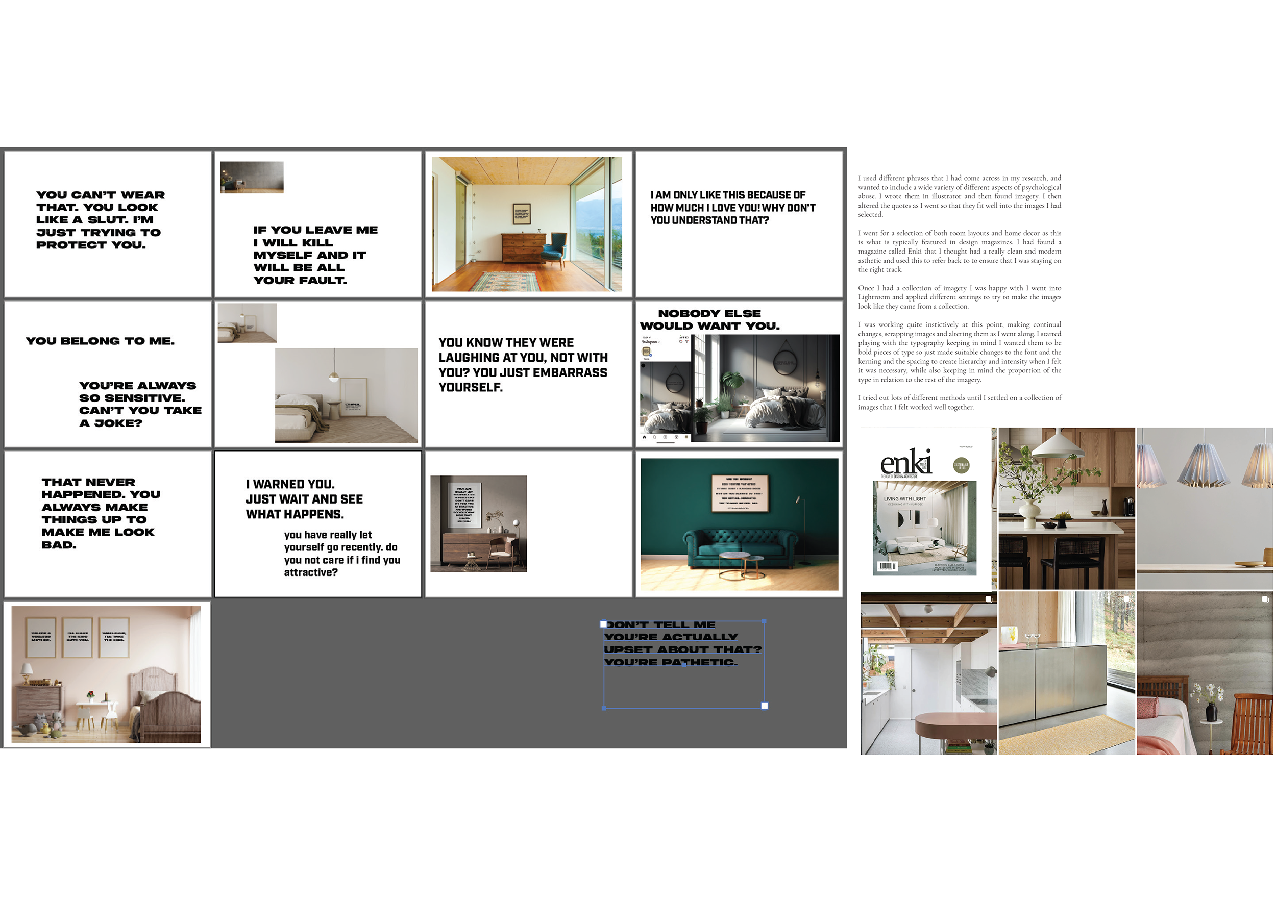
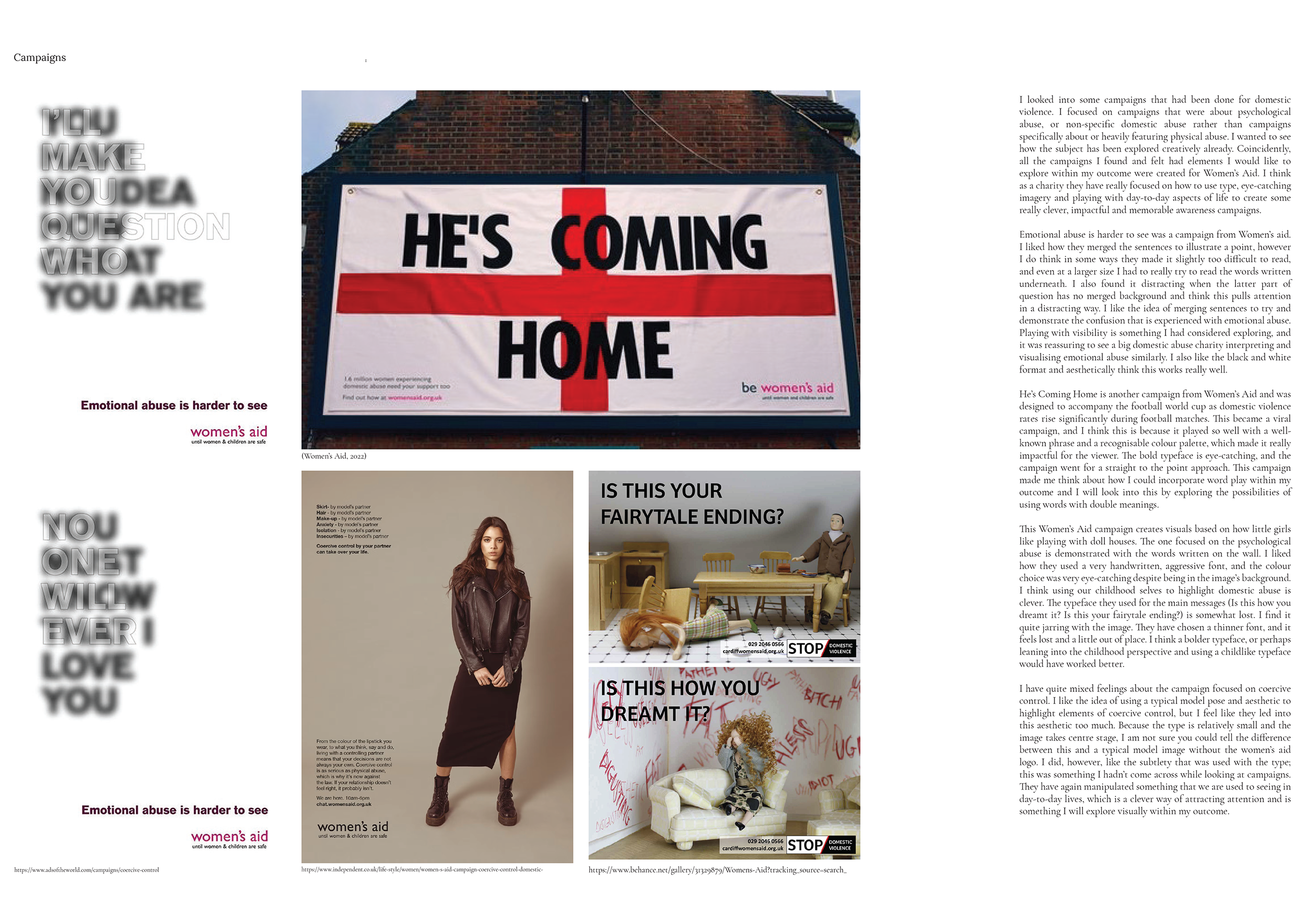
This project was built on extensive research. I explored the complex topic of psychological abuse and its legal history in the UK. I researched previous awareness campaigns and other typography campaigns.
Typography was a crucial element of the visual narrative. I selected phrases that would dominate the serene spaces and feel unsettling to the viewer, and I experimented with different typefaces to find the style that felt most fitting, impactful, and cohesive throughout.
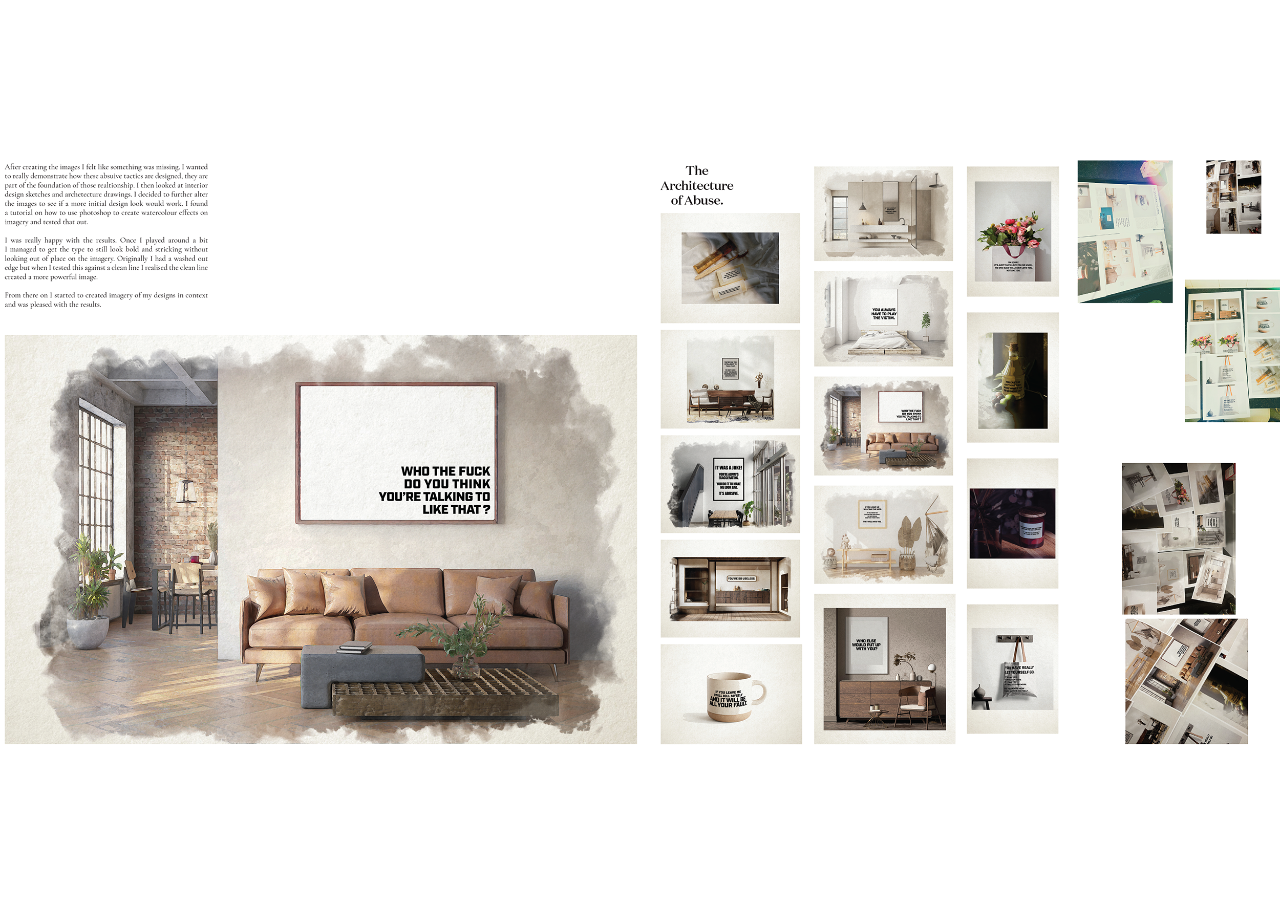
To connect the design process to the concept visually, I applied different effects in Photoshop, including overlays and FX. This aesthetic choice links to the idea that abuse, much like a meticulous design, is deliberately and strategically constructed to destroy. It reveals the cold, calculating nature behind the phrases, emphasising that every word is part of a plan to control, and dominates the home of those living with it.

The Architecture of Abuse
[Speculative Campaign Design]
-
‘The Architecture of Abuse' is an innovative awareness campaign created for a UK domestic violence charity. The project visually explores the insidious nature of psychological abuse in a unique way, contrasting the controlling language of abusers with beautiful imagery inspired by interior design aesthetics.
This project was created as part of my degree. I was given free rein to write my own brief and pick my own concept, subject matter, and outcomes.
-
The campaign features common abusive phrases, such as "If you weren’t so stupid, I wouldn’t have to shout" or "if you leave me, I will kill myself and it will be all your fault," presented within beautiful, Instagram-worthy home designs. By integrating these phrases into interior design visuals, the subtle and insidious way psychological abuse can dominate a person's life and environment is shown to the audience.
-
Designed primarily for Instagram's audience of over 2 billion users, the campaign's visuals are crafted for maximum engagement. The use of home decor elements places the campaign directly into feeds focused on interior design, not only reaching an audience, but also allowing it to stand out in a space it is not expected. This approach transforms the issue of psychological abuse into a visually compelling and shareable message.
'The Architecture of Abuse’ turns beautiful and visually pleasing imagery into a powerful tool for social change while also raising awareness about the issue of psychological abuse.
-
This project challenged me to tackle a difficult subject and translate it into an impactful campaign. My goal was to create something that would not only raise awareness but also communicate a message innovatively, while keeping the intended audience and who it was being designed for at the forefront of all design decisions.
Placing the campaign in unexpected places, such as interior design magazines and specific areas of social media feeds, made the message far more impactful. Exploring strategic context in this way enabled the designs to stay focused and relevant. It forced the audience to confront the issue in a space they typically associate with comfort and beauty.
I believe one of the project’s biggest strengths is the concept. The idea of linking psychological abuse [which, by its very nature, is designed] to interior design provided a powerful framework for all the design decisions, from typography to image selection. My love of research allowed me to ensure that I kept the project informed, relevant, and factual.
There would be potential to explore further partnerships with home décor brands and opportunities to move the campaign away from digital and printed material and feature it within stores, utilising disruptive design methods.
-
Campaign Concept & Development
Visual Identity Design
Layout Design
Typography
Conceptual Thinking
Research
Problem-Solving
Storytelling
Adobe Photoshop
Adobe InDesign
Adobe Illustrator
Figma
Social Media
-
A key component of this campaign was the ability to reach a wide audience. Through research, I identified potential partnerships that could significantly amplify the message.
The mockups below demonstrate a visual plan for how 'The Architecture of Abuse' could be featured in leading home and interior design magazines, utilising another form of media to maximise engagement and raise awareness.
-
This project was built on extensive research. I explored the complex topic of psychological abuse and its legal history in the UK. I researched previous awareness campaigns and other non-related typography campaigns.
Typography was a crucial element of the visual narrative. I selected phrases that would dominate the serene spaces and feel unsettling to the viewer, and I experimented with different typefaces to find the style that felt most fitting, impactful, and cohesive throughout.
To connect the design process to the concept visually, I applied different effects in Photoshop, including overlays and FX. This aesthetic choice links to the idea that abuse, much like a meticulous design, is deliberately and strategically constructed to destroy. It reveals the cold, calculating nature behind the phrases, emphasising that every word is part of a plan to control, and dominates the home of those living with it.