
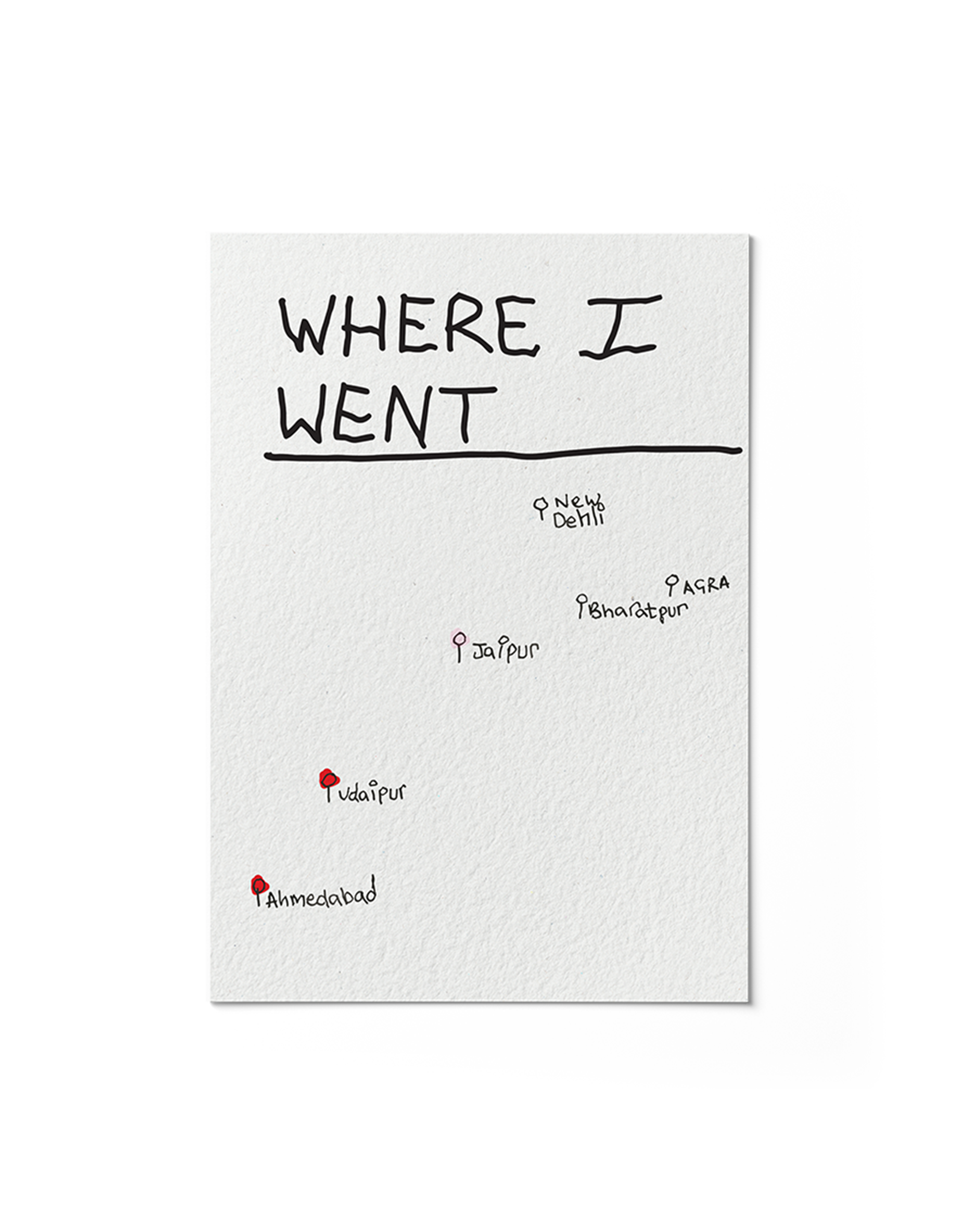
About the Project
‘This is a Heavy Book’ is a publication created in response to a university module requirement following a trip to Rajasthan. It is a deeply personal project that uses the physical form of a book to explore the unseen burdens we carry, responsibility, history, and the complexity of relationships. The publication explores the emotional and psychological weight that shapes our lives and how it not only becomes part of who we are but also can help us continue forward when life gets tough.
Concept
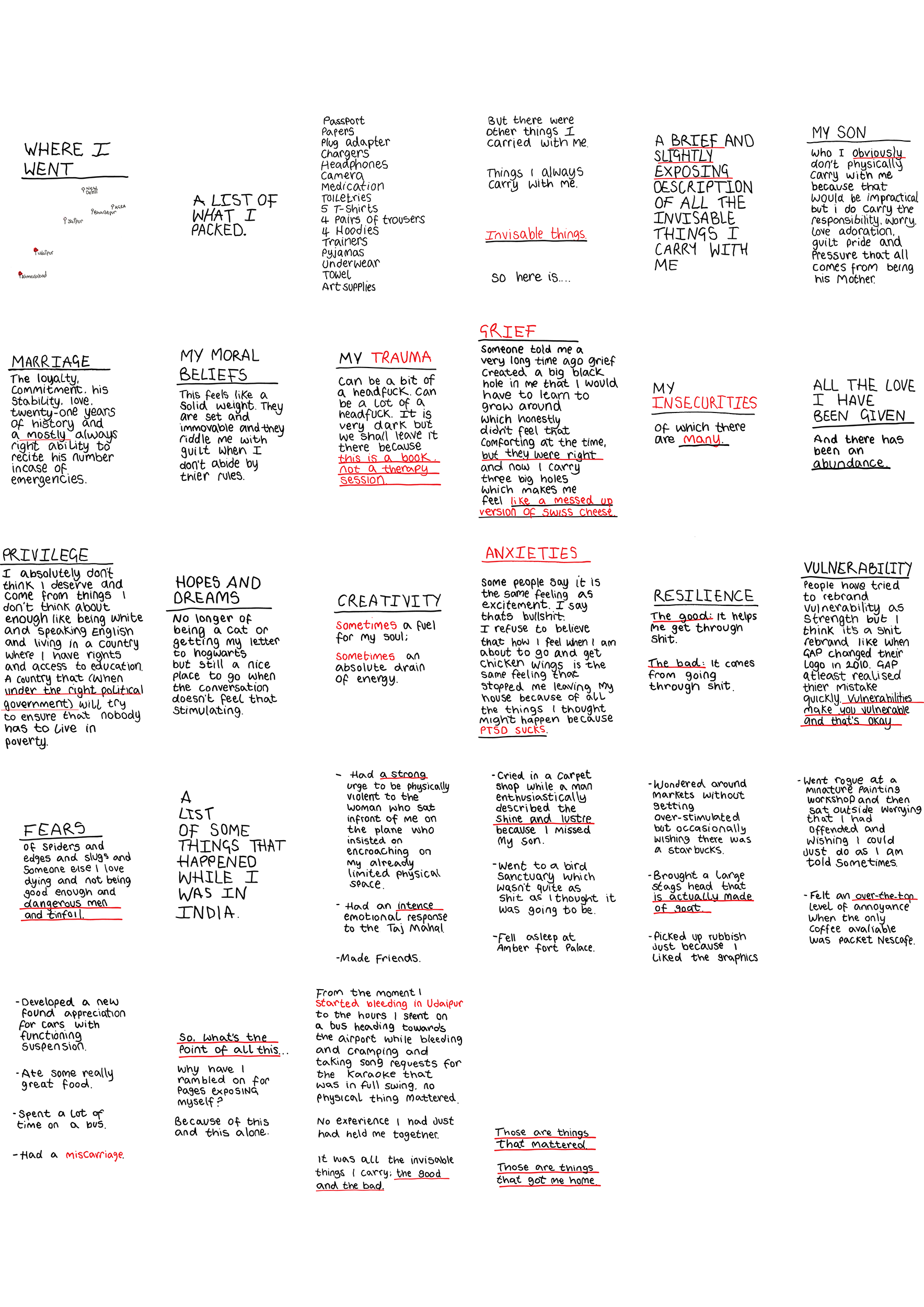
The central concept of ‘This is a Heavy Book’ is to reveal the hidden weight of our personal experiences and communicate how we are a sum of all of them. Each can serve as a tool we can utilise when dealing with difficult and challenging situations. It aims to foster human connection by being transparent about the myriad of things I carry with me in the hopes that it helps people see that they are not alone with their baggage, and that actually, we all have stuff we carry, even if we are not open about it.
Strategy
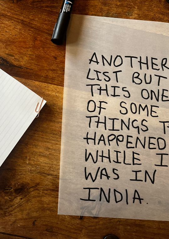
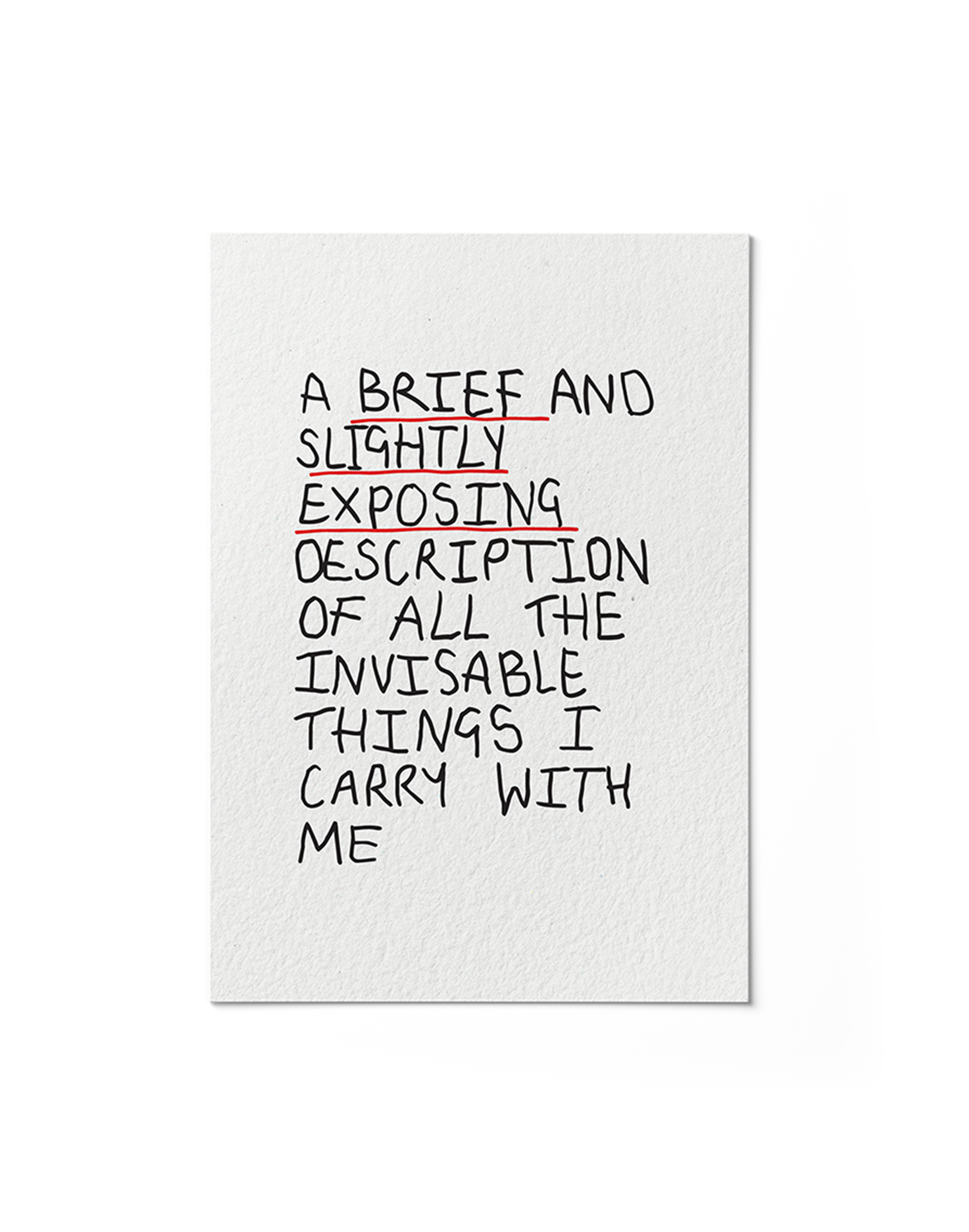
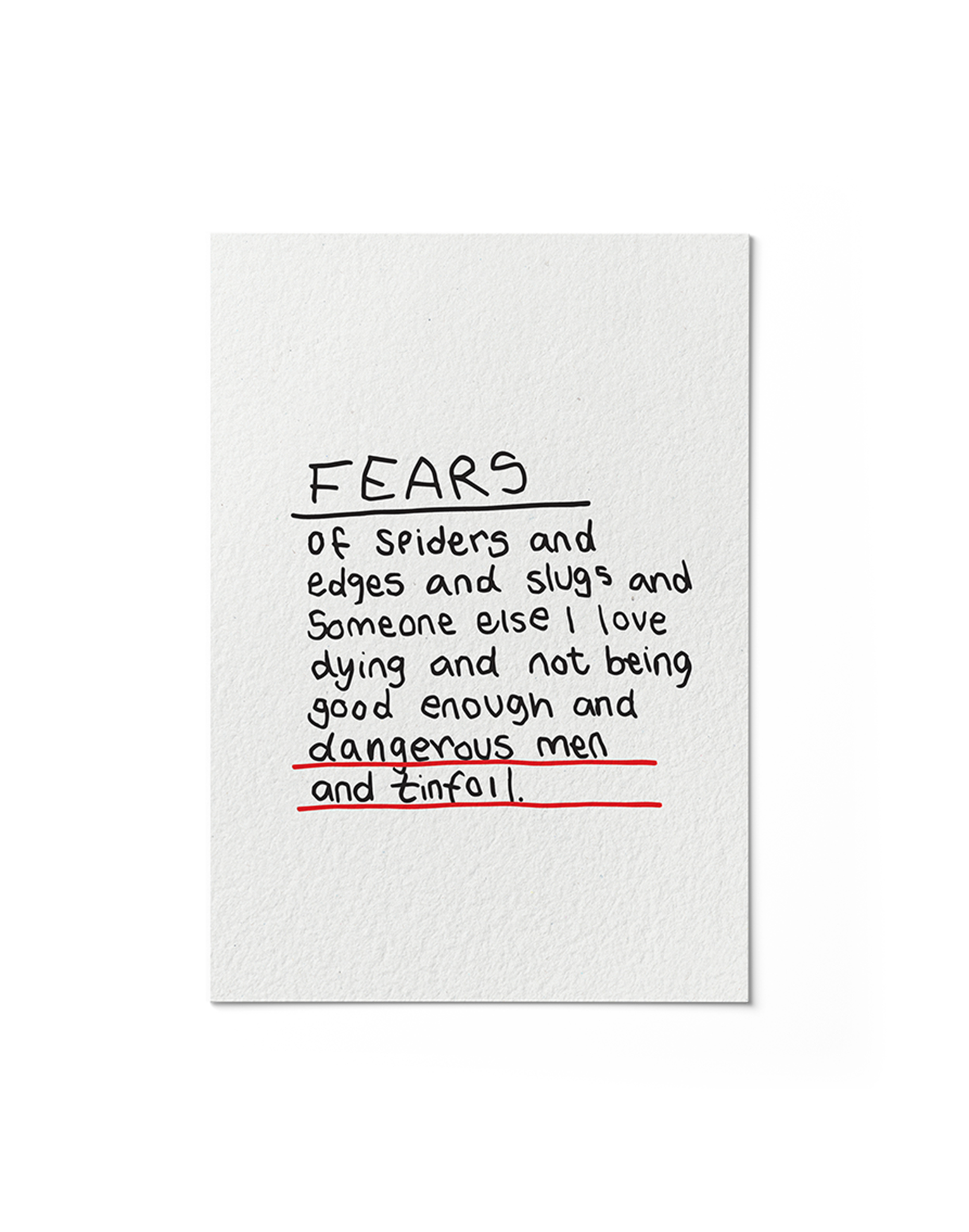
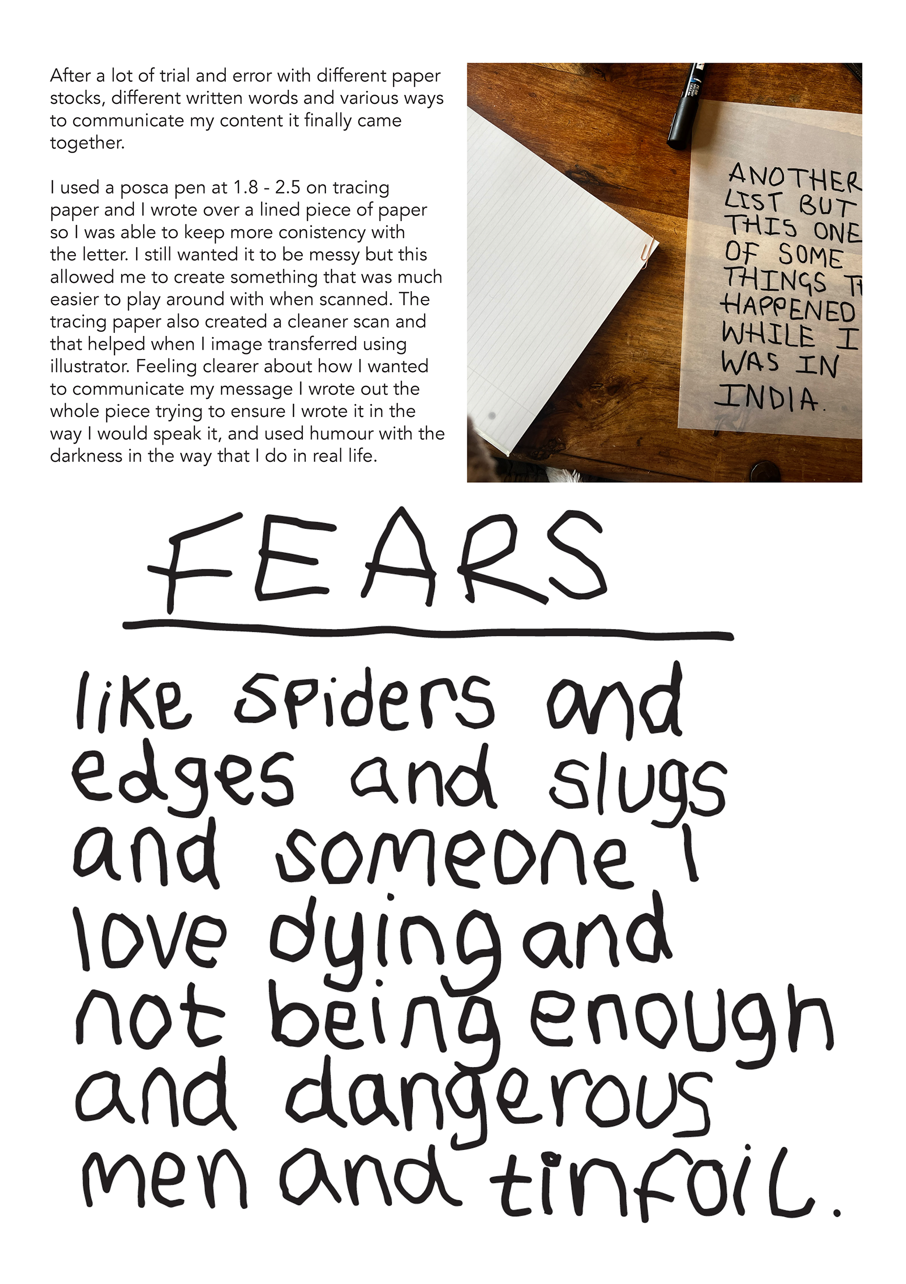
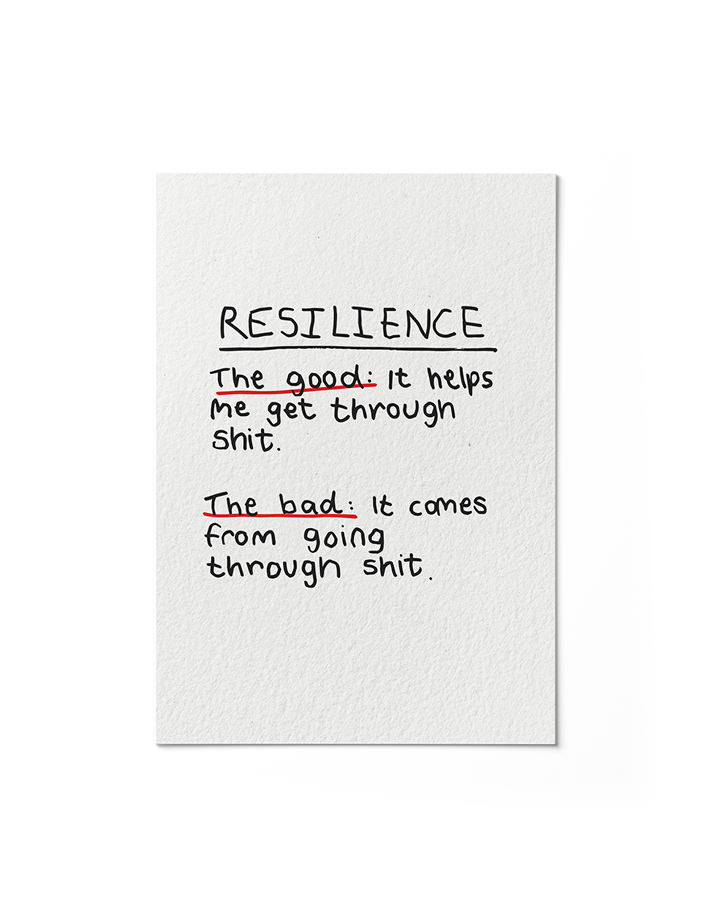
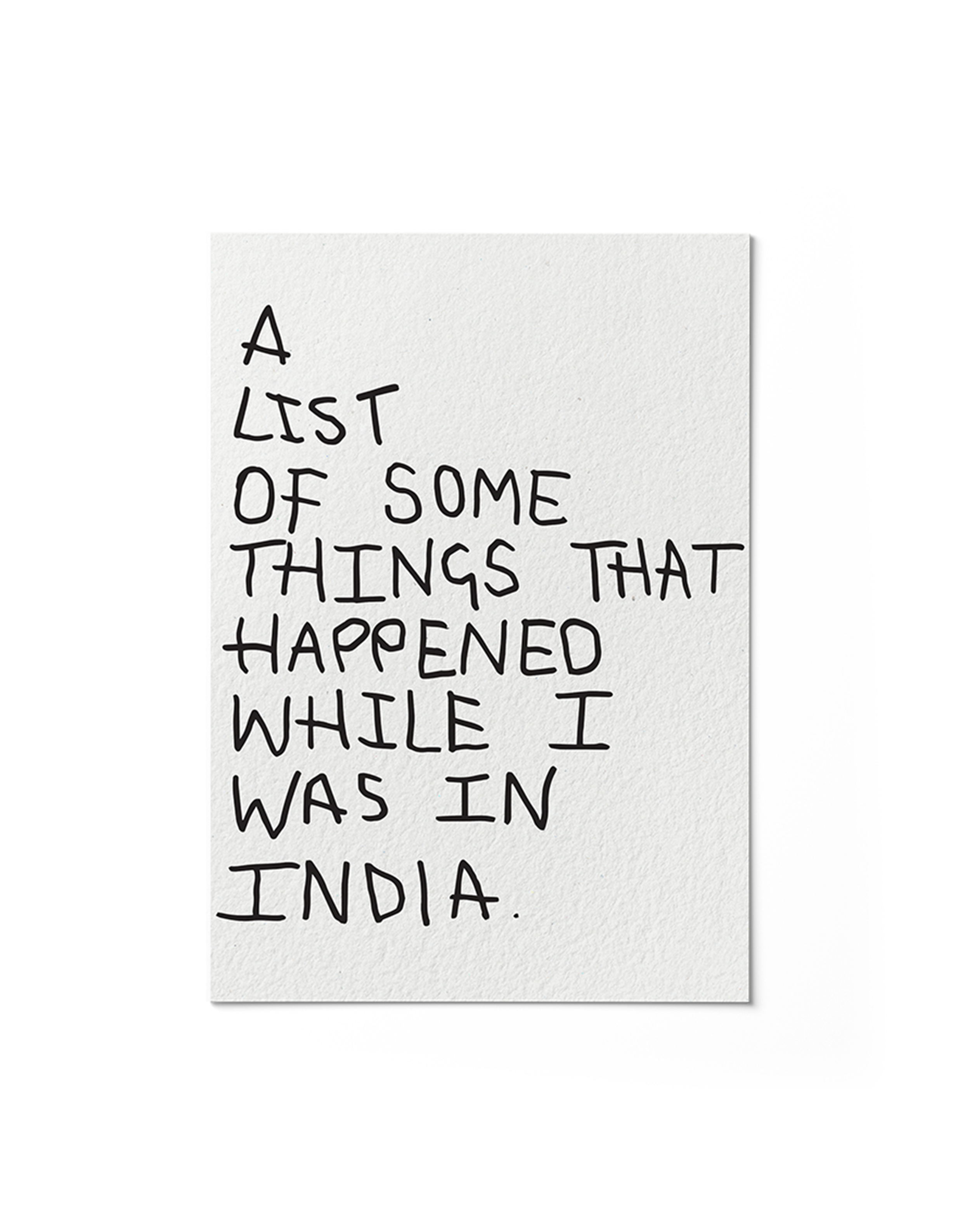
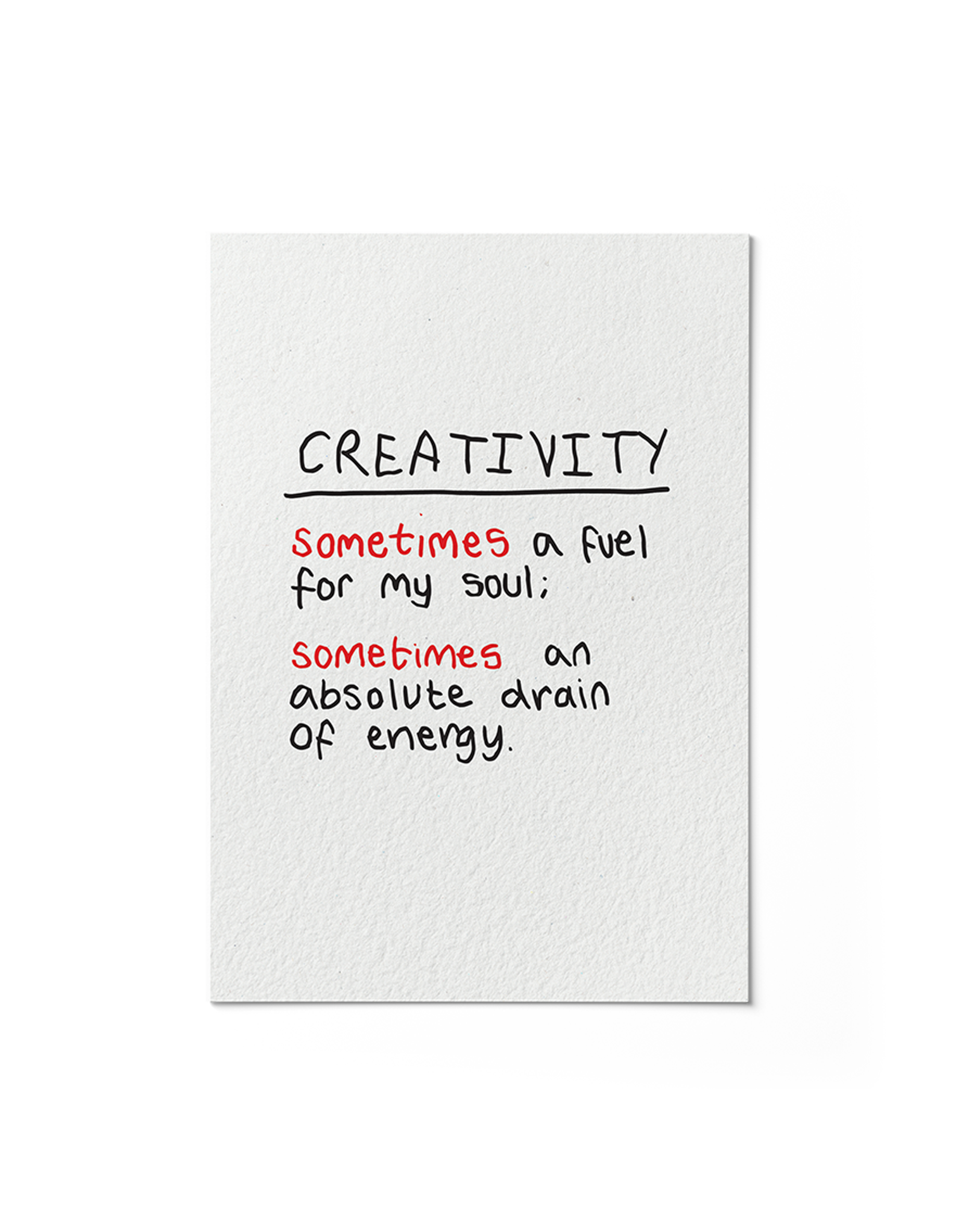
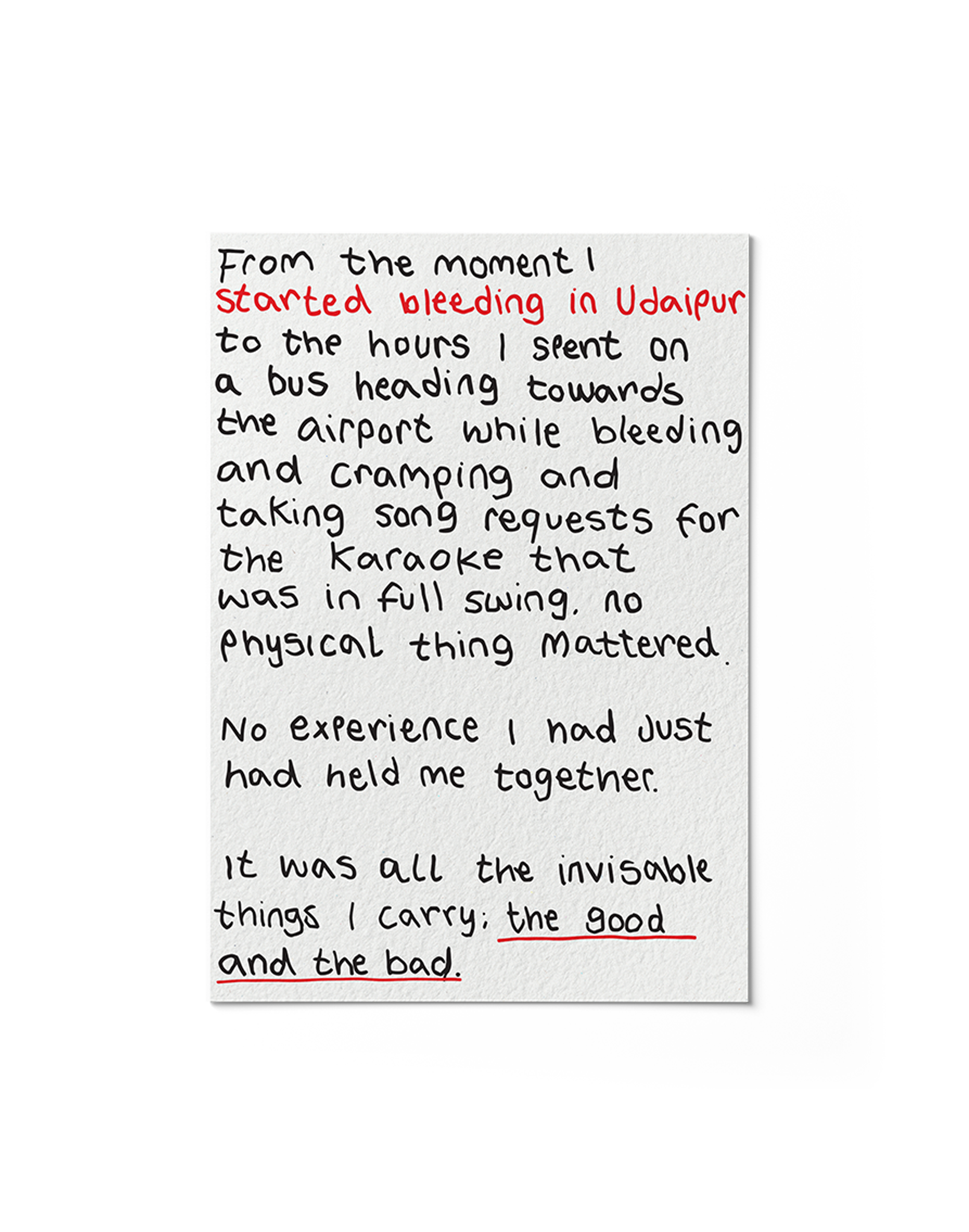
The design strategy for 'This is a Heavy Book' was to create a deliberate contrast between the publication's subject matter and visual language. To make the difficult topics approachable and less intimidating, I developed a series of hand-rendered typography for each page, using a childlike style.
A simple and cohesive colour palette was maintained throughout the publication, ensuring the words remained the central focus. This choice avoided any visual hierarchy, treating each experience equally to ensure that the overall message [that both good and bad experiences can ultimately serve us] was not lost throughout. The tone is intentionally casual and direct, using humour and matter-of-fact language to build a personal connection with the reader. I wanted them to feel like I was talking directly to them. This combination of a vulnerable visual style and a relatable voice helps the personal and sometimes painful topics become a shared human experience. The goal was for the reader to see themselves reflected in the book in the hope that it would leave them feeling less alone with their own baggage.
-
Working on ‘This is a Heavy Book’ was a chance to use graphic design as a tool for personal expression and introspection with an audience in mind. I took a hard and testing personal experience and turned it into something that I hope could help the someone feel seen and understood. I also wanted to open about my experience of a miscarriage. I have had more that one and know that it can leave you feeling isolated as it is not a topic often openly discussed. I hope that being transparent about my own experiences would help someone feel less alone. The design choices were based around creating something that I not only felt like reflected me and my voice but also felt approachable and offered some relief from the more difficult aspects of the book. This project is a demonstration of my belief and passion in the power of design to convey and reflect on the human experience and how this can help foster human connection and understanding.
-
Hand-Rendered Typography
Publication Design
Material and Print Production
Colour Theory
Conceptual Thinking
Visual Storytelling
Audience Awareness
This is a Heavy Book.
[Book Design]
Page Examples
All typography was hand-drawn using paint pens and then placed in illustrator to create a digital version suitable for professional printing.
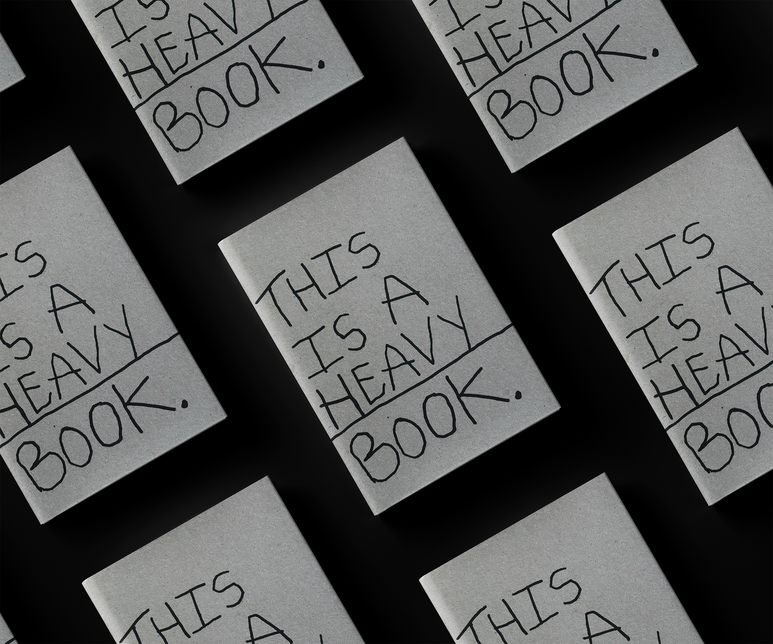
The front cover was hand-drawn directly onto greyboard. This material and technique gave the cover a raw, tactile feel that complements the book's vulnerable and honest content.

This is a Heavy Book.
[Book Design]
-
‘This is a Heavy Book’ is a publication created in response to a university module requirement following a trip to Rajasthan. It is a deeply personal project that uses the physical form of a book to explore the unseen burdens we carry, responsibility, history, and the complexity of relationships. The publication explores the emotional and psychological weight that shapes our lives and how it not only becomes part of who we are but also can help us continue forward when life gets tough.
-
The central concept of ‘This is a Heavy Book’ is to reveal the hidden weight of our personal experiences and communicate how we are a sum of all of them. Each can serve as a tool we can utilise when dealing with difficult and challenging situations. It aims to foster human connection by being transparent about the myriad of things I carry with me in the hopes that it helps people see that they are not alone with their baggage, and that actually, we all have stuff we carry, even if we are not open about it.
-
The design strategy for 'This is a Heavy Book' was to create a deliberate contrast between the publication's subject matter and visual language. To make the difficult topics approachable and less intimidating, I developed a series of hand-rendered typography for each page, using a childlike style.
A simple and cohesive colour palette was maintained throughout the publication, ensuring the words remained the central focus. This choice avoided any visual hierarchy, treating each experience equally to ensure that the overall message [that both good and bad experiences can ultimately serve us] was not lost throughout. The tone is intentionally casual and direct, using humour and matter-of-fact language to build a personal connection with the reader. I wanted them to feel like I was talking directly to them. This combination of a vulnerable visual style and a relatable voice helps the personal and sometimes painful topics become a shared human experience. The goal was for the reader to see themselves reflected in the book in the hope that it would leave them feeling less alone with their own baggage.
-
Working on ‘This is a Heavy Book’ was a chance to use graphic design as a tool for personal expression and introspection with an audience in mind. I took a hard and testing personal experience and turned it into something that I hope could help the someone feel seen and understood. I also wanted to open about my experience of a miscarriage. I have had more that one and know that it can leave you feeling isolated as it is not a topic often openly discussed. I hope that being transparent about my own experiences would help someone feel less alone. The design choices were based around creating something that I not only felt like reflected me and my voice but also felt approachable and offered some relief from the more difficult aspects of the book. This project is a demonstration of my belief and passion in the power of design to convey and reflect on the human experience and how this can help foster human connection and understanding.
-
Hand-Rendered Typography
Publication Design
Material and Print Production
Colour Theory
Conceptual Thinking
Visual Storytelling
Audience Awareness